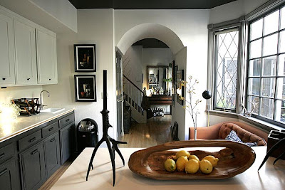
How do you make a rental feel like your own without blowing too much cash in the process? This is the age old question most people find themselves asking and, with results like this, some are also finding answers. Granted, the tenant of this Venice CA property is a designer herself as well as an HGTV personality with no doubt dozens of resources most of us are not privy to. Well, luckily, she shared a few in last weekends LA Times along with pictures that make me green with envy.

It all started in this kitchen where they set, and came in a tad under, a $1000 budget to achieve a French Normandy look. I'd say they hot the nail on the head.

I love this room. The large maritime print is hands down the focal point but the red chairs add an ideal amount of color and give the other pieces a run for their money. I find my eyes bouncing all over the place.

The mantel is sweet and simple.

I love a table lamp in the powder room. This little vignette is sexy.

Couldn't we all lay our heads down in this home? It is a nice reminder to make the most of where we are with what we have, rental be damned. You can read the full story here, complete with budget breakdowns and some cheap tips.


3 comments:
This post came at the perfect time for me as this weekend we move into our rental house after years of owning. Thank you! :)
Are you kidding me with that front door??? Amazing.
the blue door!!! i want to paint our door but i think our landlord might get mad. : (
Post a Comment